STRATEGIC
BRANDING, INC.

Redefining a Classic
Over the years, SweeTARTS, the original sweet and sour pressed candy invented in 1962, has expanded its product offerings way past just old-school pressed candy.
THE SCENARIO:
SweeTARTS packaging called attention to the unique differences among its products, but the brand itself was getting lost on the shelf.
THE CHALLENGE:
SweeTARTS turned to CSB for help to unify the portfolio without losing the personality of each product.

OUR SOLUTION:
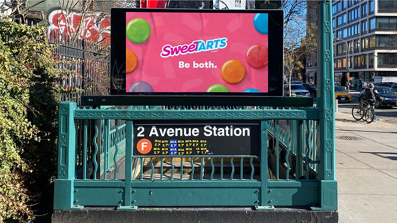
CSB restored the iconic pink (sweet) and blue (tart) background split that had been in use for 55 years of the brand’s history. This strategy aligned with the brand’s new “Be Both” campaign, which declares that no one is “just one thing” – you can be both!

OUR DESIGN LANGUAGE HIGHLIGHTS SWEETARTS' DIVERSITY OF FLAVORS, TEXTURES AND FORMS THROUGH A CLEAR COMMUNICATION SYSTEM AND DELICIOUSLY APPETIZING PHOTOGRAPHY.


WE INFUSED ELEMENTS FROM THE ‘BE BOTH’ BRAND RELAUNCH CAMPAIGN INTO BACK PANELS AND SECONDARY IMAGES FOR A HARMONIZED VISUAL BRAND PRESENTATION.

OUR BRAND ARCHITECTURE NEEDED TO INCORPORATE PRODUCT INNOVATIONS WHILE REMAINING TRUE TO THE MASTERBRAND.
CSB CREATED EXPRESSIVE BACKGROUND GRAPHICS AND A CALL-OUT SYSTEM THAT HIGHLIGHT NEW FEATURES WHILE AVOIDING DISRUPTION.

SWEETARTS CANDY DELIGHTS CONSUMERS THROUGH AN ARRAY OF TEXTURES, COLORS AND FLAVORS THAT WERE IMPORTANT TO CAPTURE. WE PHOTOGRAPHED AND RETOUCHED PRODUCTS IN-HOUSE AND WITH OUR PARTNER, MIKE WEPPLO, FOR MOUTHWATERING IMAGERY.
OUR BRAND ARCHITECTURE NEEDED TO INCORPORATE PRODUCT INNOVATIONS WHILE REMAINING TRUE TO THE MASTERBRAND.
CSB CREATED EXPRESSIVE BACKGROUND GRAPHICS AND A CALL-OUT SYSTEM THAT HIGHLIGHT NEW FEATURES WHILE AVOIDING DISRUPTION.

WINNER, 2021 GDUSA PACKAGE DESIGN AWARD, FOOD + BEVERAGE CATEGORY
This annual program celebrates attractive graphics, but more importantly the power of effective design to advance the brand promise and to forge an emotional link with the buyer at the moment of truth.

Helping consumers navigate
SweeTARTS needed to work as a strong family in a cluttered, colorful environment. We unified color and wayfinding to stand out on shelf.
Our pink and blue split creates an ownable colorway and vertically links packs to work together. This resulted in high findability in consumer testing.

CORNERSTONE STRATEGIC BRANDING, INC.
LET’S CONNECT: info@cornerstonebranding.com 212-686-6023
FOLLOW US