STRATEGIC
BRANDING, INC.

Making Butter Beautiful
Back in 2017, BKLYN Body was created by founder Jasmine for her baby daughter Brooklyn, who had excema. Jasmine developed a custom, clean-ingredient body butter, followed by lotion and oils.
THE SCENARIO:
Though the brand name was Brooklyn Body Butter, the company is based in a Detroit suburb. Jasmine wanted to take the brand to the next level for beyond-DTC distribution.
THE CHALLENGE:
We needed to move away from Brooklyn equities and convey a big brand impression, while reflecting the product’s bold scents and owner Jasmine’s outgoing personality.

OUR SOLUTION:
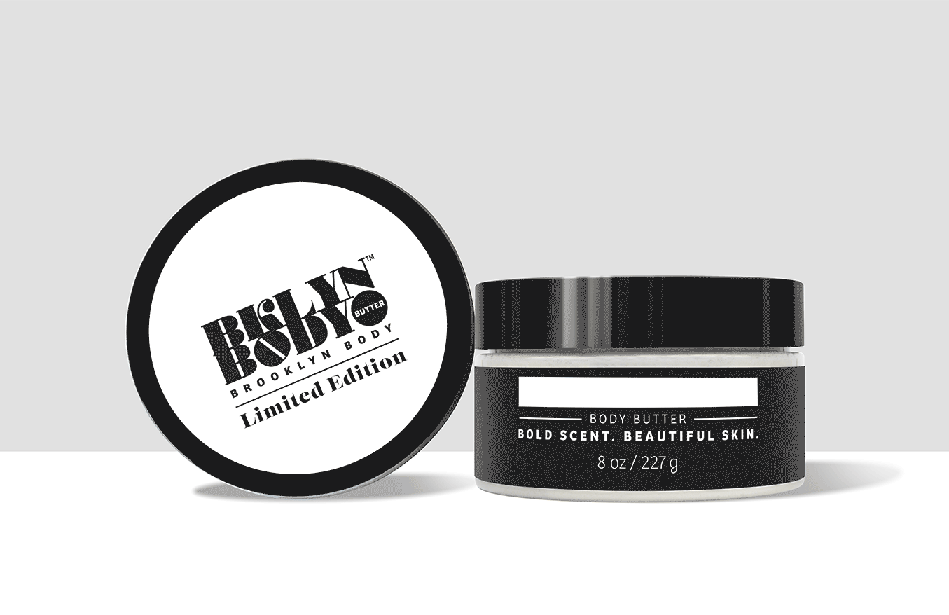
CSB created bold, serifed branding with fashion magazine cues and an optimistic, upward-facing ‘O’ to speak to the brand’s future.
We abbreviated the name to BKLYN Body for a hip, shorthand moniker and eliminated ‘butter’ to allow for expansion. As an intermediate step, we included ‘Brooklyn Body’ in sans serif type to aid consumer transition.
CSB CREATED ICONS TO CALL OUT KEY PRODUCT BENEFITS IN AN ENGAGING WAY; COLOR WAS USED TO BRING EXISTING PHOTOGRAPHY INTO THE NEW LOOK, AND PRODUCT COPY WAS DEVELOPED TO REFLECT INDUSTRY TRENDS.

My Promise
Our ultra-absorbent Body Butters, Lotions, and Oils are made with carefully chosen, clean ingredients, including Shea Butter, Coconut Oil, and Jojoba Oil, which have been known to soothe even the most sensitive skin.
THE NEW IDENTITY AND STRUCTURES HAVE BEEN WELCOMED BY LOYAL CONSUMERS:
‘This rebrand is gorgeous!’ - Bria Ferguson, Ann Arbor
‘The new packaging felt very luxurious, like I should have done an unboxing’ - Ms.Yohance, Michigan
‘I love the rebranding’ - Lindsey McCall, Chicago

OUR STYLE GUIDE AND ASSET KIT PROVIDED AN EASY WAY FOR AGENCY PARTNERS TO CREATE WORK THAT FIT THE NEW BRAND PERSONALITY.
WE EXPANDED THE DESIGN LANGUAGE WITH ASSETS NECESSARY FOR A SMALL COMPANY TO PROMOTE THEMSELVES: MERCH, SOCIAL MEDIA AND GIVEAWAYS, INCLUDING STICKERS AND POP SOCKETS.

BOLD,
BEAUTIFUL
SKIN
STARTS
HERE.
#BKLYNBEBOLD


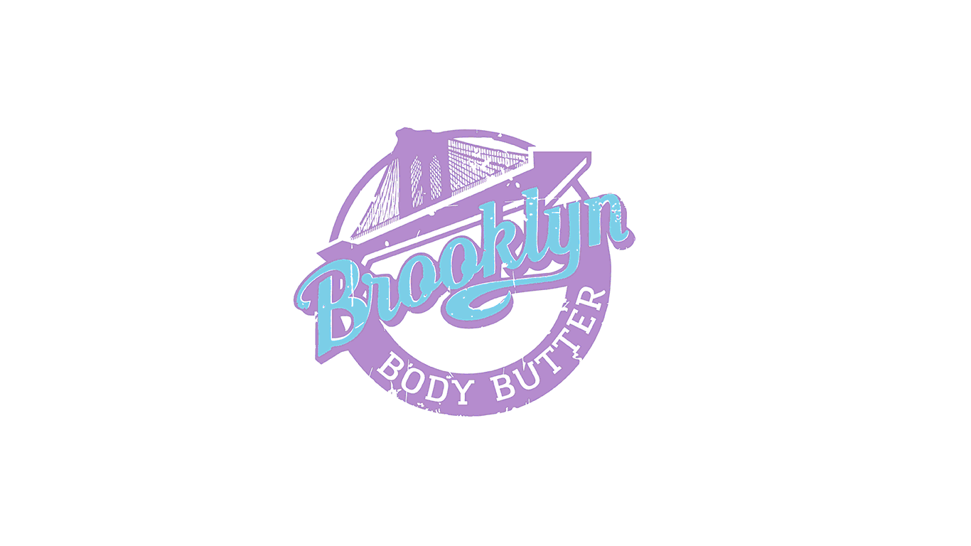
TO CLARIFY THE BRAND’S ORIGIN, CSB MOVED AWAY FROM THE BASEBALL SCRIPT, BROOKLYN BRIDGE AND STAMP EFFECT. WE INTRODUCED TYPOGRAPHY INSPIRED BY VINTAGE FASHION LABELS AND INCORPORATED A ‘BB’ MOTIF FOR EXTRA PERSONALIZATION.

CSB PHOTOGRAPHED AND RETOUCHED ALL WEBSITE PRODUCT IMAGERY TO GENERATE EXCITEMENT AROUND THE PACKAGING AND DEMONSTRATE THE TEXTURE OF EACH PRODUCT. THE STYLE FITS CATEGORY NORMS AND STANDS OUT AT THE SAME TIME.


TO ENCOURAGE REPEAT PURCHASE AND CROSS-SELL PRODUCTS, CSB CREATED A CUSTOM QR CODE AND MAILER INSERT LEADING TO THE BRAND’S WEBSITE.

WE SOURCED LIGHTER, EASIER-TO-SHIP PET JARS WITH A LOW PROFILE FOR BODY BUTTER TO ALLOW EASY ACCESS.
AS EBONI IN YPSILANTI, MI., SAID, ‘I LIKE THIS...BECAUSE MY LIL' INDEX FINGER BE STRUGGLING TRYING TO GET THE LAST OF MY BUTTER, LOL.’

WINNER, 2023 GDUSA PACKAGE DESIGN AWARD, BEAUTY + PERSONAL CARE.
This annual program celebrates attractive graphics, but more importantly the power of effective design to advance the brand promise and to forge an emotional link with the buyer at the moment of truth.
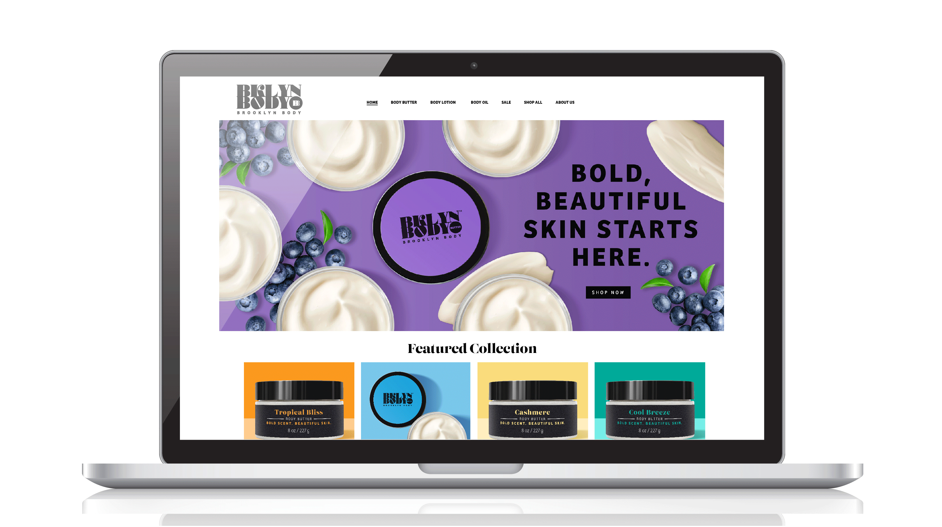
BASED ON INDUSTRY AND USER EXPERIENCE TRENDS, WE REWORKED BB’S SHOPIFY SITE WITH FRESH PHOTOGRAPHY, A NEW BRAND STORY AND REVITALIZED PRODUCT DESCRIPTIONS. THE RESULT IS BOLD, ENGAGING AND INVIGORATING.

AFTER REVIEWING ALL ASPECTS OF THE PURCHASE EXPERIENCE, WE RECOMMENDED A BRANDED MAILER TO ENHANCE THE UNBOXING EXPERIENCE, BUILD BRAND AWARENESS AND A CONNECTION WITH CONSUMERS THROUGH COLOR AND MESSAGING.

WE INTRODUCED A STRONG, VIBRANT COLOR PALETTE TO EXPRESS THE BOLD FRAGRANCES THROUGHOUT THE PRODUCT LINE. CSB ALSO SUPPLIED A SET OF COLORS FOR FUTURE SCENTS.

AFTER SEEING HIGHLY TARGETED PRODUCTS TREND, CSB RECOMMENDED A LINE EXTENSION FOR MOMS. BOLD MAMA, WITH ADDED COCOA BUTTER FOR STRETCH MARKS, DEBUTED IN 2024 IN SOOTHING PINK.
CORNERSTONE STRATEGIC BRANDING, INC.
LET’S CONNECT: info@cornerstonebranding.com 212-686-6023
FOLLOW US